IRAN ART EXHIBITION: MAKE YOUR DATA MORE MEMORABLE WITH DESIGNING PICTOGRAMS
A pictogram is one of the simplest and most popular forms of data visualization out there. Besides making your data look nice, pictograms can make your data more memorable.
Visually stacking icons to represent simple data can improve a reader’s recall of that data and even their level of engagement with that data. Pictograms can also be a fun addition to any infographic.
If you’ve ever asked yourself, what is a pictogram, we’ll tell you all about it, show you when you should use them, and give you some inspiration with our pictogram examples.
What is a pictogram?
Pictograms are types of charts and graphs that use icons and images to represent data.
Also known as “pictographs”, “icon charts”, “picture charts”, and “pictorial unit charts”, pictograms use a series of repeated icons to visualize simple data. The icons are arranged in a single line or a grid, with each icon representing a certain number of units (usually 1, 10, or 100).
A feature of many great infographics, they’re often used to make otherwise boring facts or data points more compelling, as seen in the statistical infographic below.
And since pictograms are made from a series of icons, they’re perfect for those times when you need an attractive graphic but don’t have a graphic designer to rely on.
When to use a pictogram
Pictograms can come in handy quite often when visualizing data in infographics, reports, presentations, and even resumes!
IRAN ART EXHIBITION: You can use a pictogram whenever you want to make simple data more visually interesting, more memorable, or more engaging.
Whether you want to show the magnitude of an important stat or visualize a fraction or percentage, you can use pictograms to add visual impact to simple data.
1. Use a pictogram to show ratings or changes
We know that pictograms are great for showing simple proportions or percentages.
What’s a simple proportion that you see every day? Any guesses? Ratings, you got it!
Pretty much every site that allows customers to rate products or services (like Yelp and Amazon) uses pictograms to show the results of their five-star rating system.
We can do the same thing to visualize ratings, scores, and changes over time and space in our infographics.
Infographic pictogram examples
This pictogram example takes the form of an infographic. There’s a lot of data to be shared here about change management. Instead of becoming overwhelmed by the ratings, the star icons draw the eye to key information that makes it easier to understand.
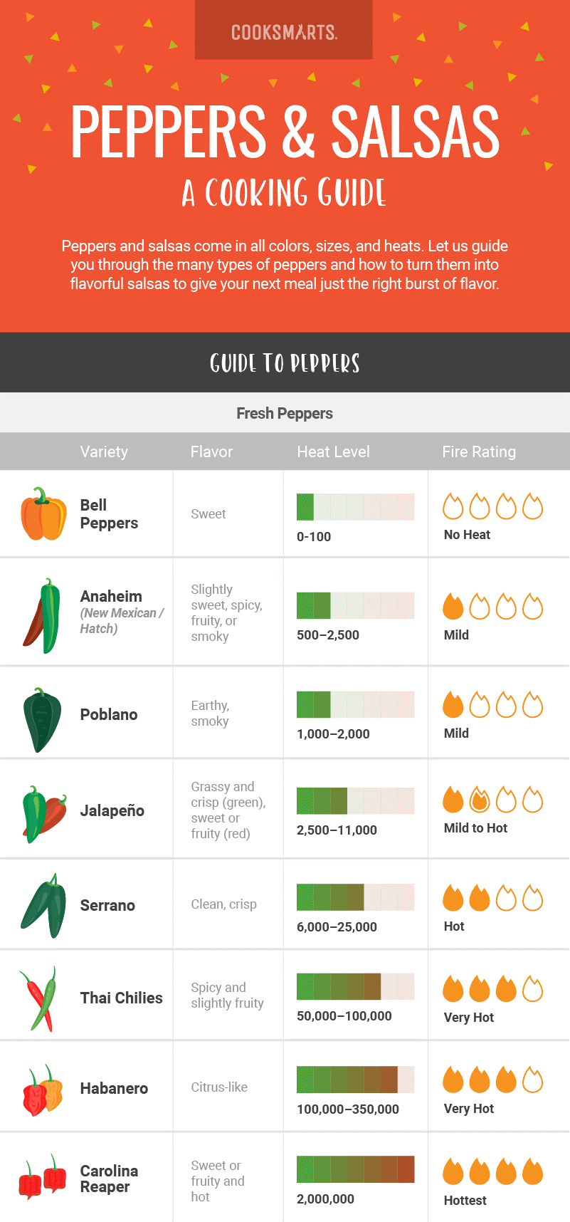
Here’s a pictogram example about peppers from CookSmarts. They’ve used a series of super simple pictograms (“Fire Ratings”) to show the heat level of various peppers.
IRAN ART EXHIBITION: Besides making the ratings easier to grasp at a glance, they’re a nice visual feature of the infographic.
Using pictograms to show ratings can be useful in everything from comparison infographics to net promoter score reports, like the example below.
2. Indicate progress to a goal in a project status report
Pictograms can also be used to indicate status or progress toward a goal. Documents like project plans, product roadmaps, and project status reports can all benefit from a visual indicator of progress in the form of a pictogram.
Report pictogram examples
In the project status pictogram, pictograms are used to give an overview of project progress and status (in terms of schedule, scope, and budget). It’s a quick way to communicate the high-level state of your project.
IRAN ART EXHIBITION: When you use a pictogram to show proportions, use a darker color to indicate the progress made so far, and a lighter color to indicate the work that remains. This use of color makes it easier for those reading the report to understand how much work remains to be done.
3. Spice up a simple bar chart for extra impact
As mentioned earlier, pictograms can help make simple data more memorable and engaging.
If your infographic is centered around a simple dataset (like a single bar chart), you can use a series of pictograms to make your data a little more visually interesting.
4. Use pictograms as visual tallies to summarize survey results
Infographics are perfect for summarizing and presenting survey results. They’re much more interesting than numbers simply placed in tables and spreadsheets, and they can help your readers grasp key survey insights.
Survey pictogram examples
Pictograms are a great way to showcase impactful survey results in an infographic. You can use them as visual tallies, to demonstrate things like basic demographic data (like job title or role).
They’re also a fun way to emphasize the magnitude of various numbers. Another great pictogram example with this technique can be seen in the popular YouTube video The Fallen of World War II, which uses pictographs to hammer home the death toll of the major wars in human history.
IRAN ART EXHIBITION: Instead of simply stating the number of deaths from each country, they’ve used pictograms to give those numbers even more significance.
5. Refresh your resume with pictogram skills summaries
The infographic resume is emerging as a creative way to communicate your skills visually and experience to potential employers.
Since pictograms work so well for showing proportions, they make a great addition to the skills summary portion of an infographic resume. You can use them to show your level of proficiency with each of the skills in your professional toolbelt.
Resume pictogram examples
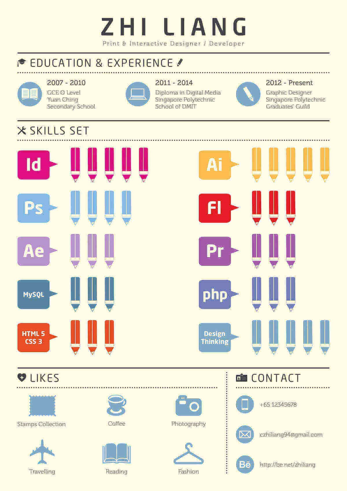
Check out this infographic resume from Zhi Liang, for example. As a graphic designer, he’s created a very visual resume to show off his graphic design skills. He’s used a collection of simple (yet effective) pictograms to give a quick snapshot of all of his skills.
If you don’t want to go all-in with an infographic resume, opt for a standard resume with simpler pictograms. Use basic circle or square icons and neutral greys for a subtle, more professional look that works just as well, as in this pictogram example.
Pictogram design best practices
Pictograms can be very effective additions to any visual document, as long as you use them the right way.
IRAN ART EXHIBITION: Here are a few design best practices to keep in mind when you’re working with pictograms in your infographics.
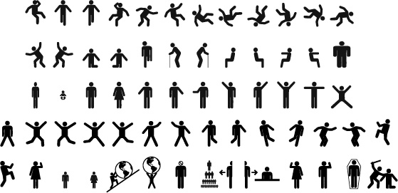
1. Use simple, meaningful icons to make your pictograms clear
Pictograms work best when their component icons are as simple and universally understood as possible.
Icons that are too detailed will tend to distract readers from the data – obscuring the pictogram instead of showing it more clearly.
Think basic, symmetrical shapes like stars, circles, and boxes rather than detailed, illustrated icons. Single-color icons that fit roughly into a square are perfect.
At the same time, make sure the icons you choose are relevant to the subject matter of your data.
Using simple, yet relevant icons will make it easier for your audience to interpret your data.
2. Avoid contrasting colors for proportions and percentages
Using contrasting colors when representing proportions in pictograms can make your pictogram more distracting than helpful.
Instead, try to use two shades of the same color so that readers can more easily compare and contrast the data in your pictogram.
3. Stick with rows of 5 or 10 for maximum readability
You don’t want your readers to have to count all of the icons in a pictogram to get an accurate understanding of the data it represents.
So the icons in your pictograms, whether they’re displaying a single large number or a proportion should ideally add up to nice round numbers like 10 or 100. They should be split into rows of 5 or 10 to make your pictograms easier to grasp at a glance.
IRAN ART EXHIBITION: You can also make things easier for your readers by ensuring each pictogram is accompanied by a bold label – a large number that states the takeaway of the chart.
It doesn’t have to be anything fancy. Just a basic label that clearly tells the reader what they’re looking at.
Conclusion
Pictograms are a great addition to a number-heavy or text-heavy infographic. They’re ideal for statistical infographics because they can give a snapshot of quantity and volume in a visually impactful way.