IRAN ART EXHIBITION: IMPORTANCE OF DESIGNING LOGO IN EVERY GROWING BUSINESS
At the very basic level, logos are symbols made up of text and images that help us identify brands we like. But they can be so much more! A good logo is the cornerstone of your brand. It helps customers understand what you do, who you are and what you value. That’s a lot of responsibility on a tiny image! Here’s the definition of what a logo is and how to make the most of it.
What is a logo? Here are the main elements logos consist of.
What is a logo?
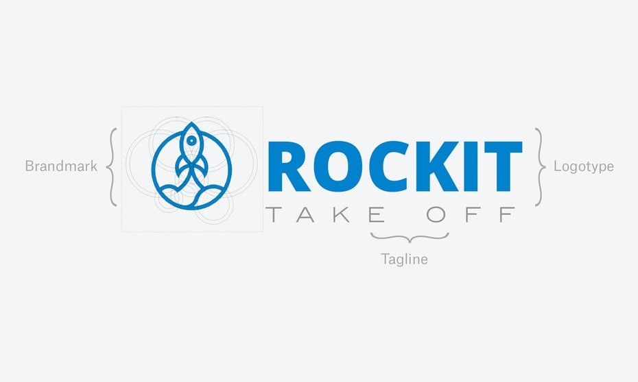
A logo is a symbol made up of text and images that identifies a business. A good logo shows what a company does and what the brand values.
Logo design is all about creating the perfect visual brand mark for a company. Depending on the type, a logo usually consists of a symbol or brandmark and a logotype, along with a tagline.
What does a logo do?
Logos do something aside from look pretty, right? Yes! Logos serve many functions.
A logo makes you stand out from the competition
Perhaps the most fundamental function of a logo is giving your business a unique mark that differentiates you from other businesses.
This is especially important if your business has competition (which 99.9% of them do). Before you get a logo for your business you’ll want to research what your competitors’ look like so you can position yourself.
IRAN ART EXHIBITION: Of course, you don’t want to be so unusual that potential customers don’t understand your brand.
A logo identifies key information about your business
Along with demarcating your business, a good logo also provides your customer with some crucial information about your company: it can communicate the industry you exist in, the service you provide, your target demographic and your brand values.
For example, a company might use circuit imagery into their logo to show that they operate in the software industry. Or they might use a specific color to communicate they are committed to being green/environmental. Or they might use a stylish font to highlight that they are luxurious.
A logo builds brand recognition
Logos also leave a visual impact that reminds your customers that, well… that you exist!
In other words, logos can create strong visual associations with a business. This association helps customers keep your brand in mind.
Think about brands like Nike or McDonalds, whose logos are so ubiquitous that they can be instantly recognized with or without the name attached. It’s no surprise that logos are such a central part of brand identity.
What are the elements of a logo?
Now that we know what a logo does, let’s look at what they are made of. Star-dust, chocolate chips, recycled board games? Close but not quite!
While there is no definitive answer, we can break down some of the common logo design elements. These elements work together to form 7 types of logos.
Typography
IRAN ART EXHIBITION: When it comes to form, a logo will usually contain some kind of typographic element. This can range from a monogram-style single letter, to an abbreviation or the full title of the business.
Imagery
Sometimes typography is accompanied by symbols or icons. These can be representative or composed of abstract geometric elements.
In certain instances, logos also include decorative elements such as line work or visual punctuations—such as small stars or dotted lines—that don’t necessarily create a specific, stand alone image.
Color
Beyond form comes color. Logos can be black and white, monochrome or multicolored. Multicolored logos often have palettes that are either analogous, meaning colors of similar hue, or complementary, meaning colors of distant or opposite hue.
The Synergy example contains a full color, complementary color palette. For more on color, check out our Logo colors article.
Context
IRAN ART EXHIBITION: In some instances, a logo is also defined by the context in which it is used. With that said, it’s important to think about when and where logos can be applied.
Commonly we see logos online, on business cards, in storefronts, advertising and it print. But your business might have specific needs.
Static or dynamic elements
One fork in the road in logo design worth mentioning is the decision to create a static logo—one which looks the same everywhere it exists—or a dynamic logo—one which changes depending on its context. Notice how the example interchanges elements depending on the application.
What makes a good logo?
The answer: any number of different things. Let’s look at some real-life examples and talk about which elements they employ to successfully communicate their messages.
IRAN ART EXHIBITION: The nooStance logo is composed of simple typography and an illustrated mascot. It uses a multi-colored, complementary blue and yellow color palette. While the overall design is strong, this logo is largely successful in its unforgettable cuteness!
The Tapp’d logo implements an illustrated tap into the negative space between the letters of the business name. This simple but clever concept separates this logo from other businesses, makes it memorable and lets the customer know that this is a place to get fresh beer!
The Lieferbräu Brewery is composed of ornate typography and decorative line-work. While the decorative grains hint at the fact that this is a brewery, the message here is class. The design is elegant and sophisticated—there’s no mistake what the brand values are here.
Some businesses have a name that plays a part in explaining the business and doesn’t need a logo that is overly designed. In the example above, the name “Rhythms” helps let the user know that this is a beat-making app. In this case the designer has filled in the blanks with some colored geometric broken lines. These elements help to communicate the idea that there are tracks and rhythm involved. Ultimately the design does a pretty good job of clueing in the user to what they are downloading.
Skillzy is an online education platform. Their monochromatic logo contains simple text accompanied by a symbol of an upside-down umbrella. The logo is simple and attractive. The meaning of the upside down umbrella is unclear, but it is perhaps the mystery that intrigues the viewer. Is it a spiritual reference to possession? It sure got us thinking! Whatever it means, this simple combination of elements separates the business and leaves an unforgettable mark.
Some of the most successful logos are not conceptual or complex at all. In fact the Artisan Pies logo featured above is perhaps the most perfect possible solution for this business. The name tells the viewer exactly what the service is, the design communicates their no-BS brand values and the serif typeface lets you know that they take pies seriously! Not to mention the name is so simple that it’s hard to forget!
The Fatima Frankfurter 3k/5k Walk-Run uses a running hot dog mascot to tell the story. In some cases obvious is good, especially for a periodic event that wants to pull in as many people as quickly as possible. Don’t be afraid to spell things out for your target demographic.
The Brollywood Farm logo uses an ornate-yet-simple monochromatic design featuring an illustration of a farm. Not only does it quickly let the viewer know that it is a farm logo, but the vintage look communicates that the brand values are simple and rustic.
The PrinstaIndia uses a complementary monochromatic design that proves that color choice in logo is important! In this case a CMYK palette is used which has strong connotations with printed media. It lets the customer know that if they are looking for printing services that PrinstaIndia can help them.
How is a logo different from branding?
One common confusion we see comes in understanding the difference between logos and branding. It sounds complicated but the difference is quite simple: Your brand is the set of perceptions people have about your company. In other words, it can be thought of as the big-picture impression that your company leaves on the customer. This impression can be left by many things, such as your advertisements, commercials, customer service, and yes your logo as well.
IRAN ART EXHIBITION: That’s right, your logo is part of your branding (not the other way around). For example, while the Apple logo is iconic and instantly recognizable, it’s not the only thing that creates their elegant, easy-to-use and customer-friendly brand identity. Those qualities are expressed through their design choices in billboard ads, commercials, web design and on-site store layout. The logo simply holds the visual association to those things. Plus let’s face it, Apple just wouldn’t be the same without that cute, partially eaten Apple.