IRAN ART EXHIBITION: FOR SELLING YOUR BOOK, PAY ATTENTION TO YOUR BOOK COVER DESIGN
The purpose of book cover design is to draw the attention of your potential readers away from all those other tomes and novellas and sell them on the idea that your page-turner is the next book they need on their nightstand. But what makes a book cover jump off the shelves? Let’s take a look at the anatomy of a book cover and how you can create a cohesive look that appeals to your readers.
It’s nice to think that the most well-written books are the most popular, but we all know that has never been true. And self-publishing has changed the game further. With over one million books being published every year, readers are never going to find your masterpiece unless you find a way to break through the clutter, get people’s attention, and convince them to crack open your book and start reading. Following these book design basics is a good place to start!
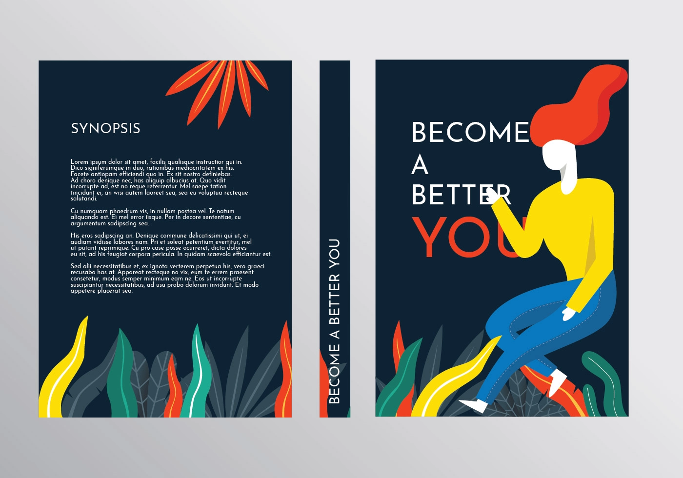
Front Cover
Think of your front cover as the preview into your book. Just like a movie preview is there to help viewers decide if they want to shell out $20 to see a film, your front cover is what your reader is going to use to judge whether they want to invest their time and money into reading your story. This is your chance to hook them and get them intrigued enough to read your book.
There are two main parts of your front cover: imagery and typography.
Book Cover Imagery
Your imagery could encompass a number of things: you could use a photograph, an illustration, geometric shapes, or just an interesting play on color. Whatever imagery you decide to use, you should showcase it in a way that feels true to the spirit of your book. So, for example, if you wrote a memoir about your summer camping in Yosemite, you might have an image of a tent with Half Dome looming in the background.
You also want to make sure you use your imagery in a design-friendly way. Make sure that your image doesn’t overwhelm your typography, and make sure it’s laid out in a way that feels balanced; you don’t want to have a ton of imagery in the top right corner of the cover and then nothing on the other three corners to balance it out.
Book Cover Typography
The typography on your cover should include three things: your book’s title, the subtitle (if you have one), and the author name. Make sure to use text hierarchy to bring attention to the more important text (for example, you’ll want your title text to be larger than your subtitle text). In terms of where your text should go, you can put your title on the top of your cover or towards the bottom; just make sure you put it somewhere above your name so it’s the first thing people read.
If you’re publishing an ebook, pay extra attention to how your cover looks at a small size, as most people will be viewing it as a tiny thumbnail. Make sure you have one clear visual element that tells your story and makes your cover stand out on the screen.
IRAN ART EXHIBITION: The right book cover design can increase your visibility by more than 50%, which means more readers nose-deep in your latest book—and more money in your pocket.
So what does a well-designed cover look like? Here are seven book cover design tips.
7 Book Cover Design Tips
1. Give readers a sneak peek of what’s to come.
2. Let the reader know the book’s genre.
3. Introduce your protagonist.
4. Set the right tone.
5. Follow the rules of design in a way that makes sense for your genre.
6. Pay attention to the details.
7. Have a distinct style.
1. Book covers should give the readers a sneak peek of what’s to come.
The cover of the universally acclaimed Life of Pi by Yann Martel does an excellent job of framing the story and building an emotional connection to the protagonist, a young man trapped on a lifeboat with a ferocious tiger.
When it comes to how much your cover should give away, think of it in terms of the “The Three Bears Principle”: not too much, not too little . . . but just enough. When a potential reader picks up your book, they should at least get a general framework of what they can expect between the front and back cover.
Your cover design should hint at the overall theme and plot of the story without giving away any major plot details or spoilers. By giving potential readers a sneak preview, you’re pointing them to the information they need to make an informed decision on whether your story is one in which they want to invest their time.
2. Book covers should let readers know the book’s genre.
In addition to giving readers a subtle preview of your plot, your cover should also clearly impart the book’s genre.
While plenty of people like a little variety in their bookshelves, most people prefer one or two genres over others. If someone picks up your book expecting a dystopian YA novel, but then reads the book description and realizes it’s a collection of humorous essays, they’re not going to buy. Similarly, the person who wants to read humorous essays is going to overlook your book because a jarring dark city scape with glowing neon text isn’t really their thing.
3. Book covers should introduce your protagonist.
IRAN ART EXHIBITION: Whether they’re irritatingly perfect or tragically flawed, a model citizen or the definition of an anti-hero, readers have to feel connected to your protagonist in order to feel compelled to read their story. If you can establish a connection with your protagonist before they ever even crack open your book, you’re ahead of the game.
Use your book cover design to start building that connection. Whether it’s overt (like adding a photo or illustration of your main character) or subtle (like visually alluding to a significant part of their character, like the bowler hat they’re never without or their cherished ‘63 bug), using your cover as a way to start building the relationship between your main character and your reader will help you attract the kind of audience that’s going to want to hear your protagonist’s story.
The cover of The Curious Incident Of The Dog In The Nighttime by Mark Haddon incorporates multiple elements of a well-designed cover. The designer alludes to the plot with the graphic of the dog and pitchfork and the whimsical font is a great representation of the child protagonist.
4. Book covers should set the right tone.
All books have a dominant tone. Maybe your book is humorous, or a huge tear-jerker, or a “who-done-it” thriller that keeps your readers on the edge of their seats, biting their nails in anxiety. And while your book surely has other experiences within its pages (sad books can have humorous moments; thrillers often have a token humorous character to cut the tension), you want to make sure your dominant tone comes through on your cover.
Your book cover design should match the tone of your book in order to attract the right readers. So, if your book is humorous, the cover shouldn’t include darkly contrasting imagery with a blood red title. And if your book is likely to rip your readers’ hearts out of their chest, cartoonish illustrations with bubble fonts have no business on the front of your book.
5. Book covers should follow the rules of design in a way that makes sense for your genre.
Good book cover design isn’t a guessing game. There are very specific rules and guidelines to follow if you want to create a well-designed anything, from a t-shirt to a website to a—you guessed it—book cover. And if you want your book cover design to lure in your ideal reader, you have to follow the rules, too.
Use fonts that are genre-appropriate and easy to read. Use text hierarchy to emphasis the important text on your cover, like your title. Create contrast between the background colors and the text to make it pop off the page and grab your readers’ attention. Leverage color psychology to elicit the right emotional responses from your readers.
IRAN ART EXHIBITION: Design rules are rules for a reason: they work. And when you integrate them into your book cover design, you can trust they’ll work for you.
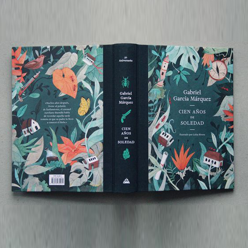
6. Book covers should pay attention to the details.
What’s the difference between looking like a total amateur and having a book cover design that makes your readers automatically assume you’re a seasoned pro?
The details.
The details are really where you have the opportunity to elevate your design to a whole new level. Things like lighting, shading, image treatment, image arrangement, text hierarchy, and layering are what takes a book cover design from “ok” to “epic.”
Your book cover design isn’t a place to cut corners. You want to make sure every detail of your cover positions you as the capable and professional author you are. IRAN ART EXHIBITION: Get your overall cover design idea locked down and then work with your designer on all the small details and finishing touches until it’s perfect.
The cover design for Prep by Curtis Sittenfield follows all the rules for a great book cover design. The lavender, pink, and green color palette as well as the preppy belt graphic are the perfect match for the coming-of-age story about an elite boarding school.
7. Book covers should have a distinct style.
Want to know what won’t help you attract more readers? Designing a book cover that looks like literally everything else on the shelf; think another romance with an oil painting of Fabio staring off into the distance wearing a loincloth. Yawn.
If you want your book to fly off the shelves and straight into the hands of your readers, it needs to have a distinct visual style.
Of course, this is a tricky balance. You don’t want to break any of the rules above: your book still needs to make it clear that the readers are getting a cave man romance. But could you do it in the style of a cave painting? Now that would be unique and intriguing!
IRAN ART EXHIBITION: Not only does this grab your readers’ attention, but it can also help build your author brand; if you integrate your distinct visual style into all of your book covers, it will make it easier for your readers and the world at large to recognize your work.
Back Cover
Once you’ve hooked people with your front cover, they’ll flip your book over to find out more information about the book. The back cover is your chance to build on the intrigue you sparked on the front cover and close them on the idea that your book can’t be missed.
On the back cover, you can include:
• A blurb about your book, also know as the book description
• Book reviews
• An author bio
• ISBN and barcode
Make your book description or reviews the focus of your back cover (since those are the elements most likely to push people over the edge and inspire a purchase). Then, put your author bio, ISBN, and barcode on the bottom quarter of the page.
If you’re publishing a hardcover book, some of this information can be put onto interior flaps of the dust jacket. Similarly, if you’re publishing digitally, this info will be text on the ebook’s description page.
Spine
IRAN ART EXHIBITION: The last part of your book cover design that you’ll need to put some thought into is your spine. Since most bookstores shelve their books vertically, your spine is the only real way for your potential readers to easily spot your masterpiece on a shelf.
When it comes to spines, you’ll want to keep it simple. On the top of the spine, write the title (this should also be in the largest font). Then, include your author name toward the bottom, followed by your publisher imprint.
When you’re designing your cover, just be sure to check with your designer to make sure your spine design will work with your book length; if your book is less than the 150 page range, you might run into some formatting issues.