IRAN ART EXHIBITION: A BEGINNER’S GUIDE TO THE FUNDAMENTAL TYPOGRAPHY RULES
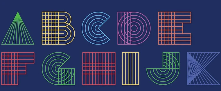
What is typography? Typography is an important part of our everyday life. We see it almost everywhere we look – on websites, street signs, food packaging, promotional posters, in the videos we watch, the books we read, and really, just everywhere.
To put it simply, typography is the appearance of text. It’s one of the most important features of every composition, both in the digital and physical worlds. The type choice can make or break every design. It helps to set the mood and emotion of any text and has a huge impact on how the reader perceives it.
Today, there are unlimited fonts to choose from and endless tricks to improve your skills as a designer. But, you should start from the basics.
Here’s a beginner’s guide to the fundamental typography rules, the key elements, the main kinds of typefaces, and useful tips to take your designs to the next level.
Typography Definition
Typography has been around since the 11th century, however, it existed even before that – as the unique art of creating words in books and magazines without much technology around. Every detail was well-thought, crafted, and carefully carried out.
And now, thanks to the Internet and the digital age, typography has expanded its borders becoming a huge part of not only publications but of every aspect of our lives.
What is Typography?
The art of arranging written letters into visually appealing, legible text is called typography. The word is derived from the Greek words “typos” meaning “form” and “graphien”, which means “to write”.
IRAN ART EXHIBITION: Nowadays, it’s not only about the legibility of the text but also about creating an aesthetic that can make the reader feel something. And to do so, it’s important to learn about this form of art and practice, practice, and (you guessed it) practice.
Typography Elements to Know About
Knowing the main terms and elements of typography will make your job easier. They will give you some basic knowledge about how you can skillfully edit your text, and not look for an immediate way out of your editor when working on your design.
Here are the typography elements you should know about before starting your project.
Leading
We call the distance between two lines of text leading (rhymed with heading) or line spacing. It’s an important factor that makes your text more legible. If your lines are too close to each other, then it will be difficult for people to read them, which you absolutely don’t want. And yet, with too much space between your lines, it’ll also be a struggle. So, keep the balance, and if at times you don’t know what line spacing to use, the default one is pretty fine.
Tracking
IRAN ART EXHIBITION: The space we see between the characters of the text is called tracking or letter spacing. When working with most software and online tools, you can usually apply both positive (making more space between characters) and negative tracking (making words appear tight). Make sure you don’t apply more tracking than needed, so your composition looks artistic and yet professional.
Kerning
While tracking is the spacing between text characters, kerning modifies the spacing between individual letters. It’s usually applied to single words like logos, rather than large text. If you apply tracking to a word and still notice a gap between the letters A and W, then you’ll have to use the kerning tool to make it right. Or, if you’ve come up with a one-word logo for your brand, you can use kerning to make the letters more noticeable by distancing them from each other slightly.

Alignment
Alignment is unifying your text to give it equal size, space, and distance between the elements. You can choose one of the following alignment options for your text: left, right, center-aligned text, or justified. The left-aligned text might be the best option for you since it’s easier and prettier for the eye to read.
Meanwhile, the most complicated alignment option to work with might be the justified one. The justified type is aligned along both the left and the right sides, and most of the time it messes with the space between your characters. So, it’s better to avoid it when working with text.
When choosing any of the alignment options, make sure there aren’t any lone words (“widows”) or punctuation left out in a single line. To make your text visually more appealing, keep your text clean, organized, and don’t forget to use tracking if needed.
Hierarchy
Hierarchy helps the reader’s eye to concentrate on the most important part of the text. It allows them to navigate easily, know where to start and where to go next according to the hierarchy of your text.
IRAN ART EXHIBITION: To establish a clear hierarchy, first, decide which elements you need the reader to notice and make them stand out. You can do it with a bolder style, varying fonts, colors, or a bigger size of the text.
The Main Kinds of Typeface
Before getting to the main typefaces, it’s important to understand the difference between a font and a typeface. Sometimes you might come across these two terms being mixed in a context, but what you need to remember is that a typeface is a collection of fonts and their variations, while a font is one of the text styles included in a typeface. So, to make it easy, a typeface is made up of different fonts.
For instance, Corbel is a typeface made up of Corbel Light, Corbel Bold Italic, Corbel Light Italic, etc fonts.
There are four main typeface categories: serif, sans serif, display, and script. Let’s see how you can differentiate these typeface categories based on their look.
Serif
These typefaces, also known as the Humanist style, add a tiny line at the bottom of letters. The serif typefaces were inspired by traditional calligraphy and are considered to be the most famous and oldest font styles. Some sources state that they’ve been around since the 15th century.
Serif typefaces are known as a more formal style, so you can find them in newspapers, books, and magazines.
IRAN ART EXHIBITION: They are also customizable since most of them have italics, bolds, small caps, and other options.
Even though serif is characterized by a “foot” shown at the bottom of a letter, there are many variations of them. One of the most famous serif variations is Times New Roman.
Sans Serif
Sans serif typefaces have been popular since the middle of the 20th century, and have more of a gothic feel, while serif typefaces are known as “roman”.
These typefaces are more defined, bold and modern. A famous sans serif typeface is Arial, which you can find in many headlines and announcements.
Script
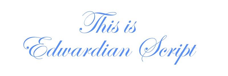
These curvy font styles are elegant, creative, and quite artistic. They have been noticeably around since the 20th century and usually look like handwritten letters.
Because of the many variations they have, most of which are sometimes hard to read, it’s better to use these fonts sparingly and not go overboard, even if they are pretty. Think about whether people can read it or not, especially when you are trying to choose a logo font for your brand.
Display
Display or decorative typefaces are fun, casual, and unique. They are usually not used in long texts, but for small amounts of texts, such as titles and headers.
There are a number of brands that use this typeface in their logos. Two great examples of this typeface style in logos are Disney and Fanta.
Important Rules and Tips for Beginners
Prioritize Readability
The most important rule of typography is to make your text readable. Small, confusing font or dark backgrounds with dark text and such will make your text unintelligible. Don’t choose colors or fonts because they are your favorites, instead consider them from someone else’s point of view.
IRAN ART EXHIBITION: Here are some tips for you to make your text expressive:
• Instead of stretching your font, and distorting it, as a result, choose taller or wider fonts.
• Use color psychology and research positively matching shades and tones to choose your colors right.
• Limit your fonts. Choosing more than two ( or a maximum of three) fonts will make your composition look too heavy and complicated to read.
Work With Grids
To make every little detail of your text design perfectly professional, use design grids. It will help you to create a visually harmonic piece and easily align the elements of your text composition.
If you are a beginner, you can start with simple grids, to understand how they work first.
And later you can change to more complex ones, however, remember that you don’t have to fill your whole page with elements and texts. Leaving generous amounts of white space is always a good idea. It will let your text breathe and help the reader catch the important information.
Avoid Trends
Trends almost never last long, and the same goes for typography. Choosing a font that’s trending, for the time being, is going to later make complications for your brand. You can choose classic typefaces since they are the ones lasting for a very long time.
IRAN ART EXHIBITION: The same goes for every typography element – color, size, style. Don’t choose what’s trendy. Choose what suits your brand or the message you want to convey through it.
Practice Makes Perfect
Whether you’re a beginner or a skillful guru, you never really stop learning. So practicing your skills is a must, if you want to reach perfection.
Mastering typography tricks and rules will give you all the base you need to start using them on various projects. Practice these rules to find your approach, style, and signature, and later to have all the authority to think outside of the box and break the rules with class.
Summing Up
To put it simply, typography is the process of giving your text a visual appearance. It’s in every aspect of our lives, in many styles and shapes.
There are four main typefaces that text fonts fall into – serif, sans serif, script, and display.
By learning the main terms and rules of typography, you’ll be able to improve your typography skills, look at every design with a more open mind and come up with creative solutions.
IRAN ART EXHIBITION: However, if you want to start small and have professional text designs with minimal effort, you can always turn to online graphic maker tools. All you’ll need to do is choose the template you like, add your text and download your design.
